Augen Auf
a test recommendation tool designed for eye clinics
Duration
3 weeks
DELIVERABLES
Workıng mvp
Role
Product Designer
UX/UI desıgner
buılder
(Vibe Coder)
tools
Fıgma
buılder.ıo
Claude code
keywords
Problem
The self-paid medical test market is worth €2.4 billion in Germany. However, the experience around it is poorly designed. The burden of informing patients falls entirely on medical staff who are already quite busy, and most importantly, that gap leaves patients unable to make an informed decision about their own care.
Patient:
"I am not aware of possible tests that are recommended for my condition in this practice. Also, it seems there is no one available to ask."
Medical Staff:
"I am too busy with all my tasks, so I cannot inform all patients about the availability of additional tests."
Practice Owner:
"By offering more self-pay tests, I want to recover my investment in expensive medical equipment."
Solution
By providing a service that allows patients to inform themselves about potential self-paid tests tailored specifically to their conditions, Augen Auf reduces the workload on healthcare staff and enables clinics to offer more tests and better healthcare services to their patients.
Key Principles
Get informed, get better care: Patients explore the options at their own pace and understand what each test is for, what it costs, and how it relates to their condition.
Not like a form, but like a magazine: No one wants to fill out a boring form. That’s why, instead of being just another digital form, Augen Auf aims to be a product, like a magazine in the waiting room, that patients will naturally engage with.
Anonymous by design: No name, no email, no age. The product do not collect or process any personal information.
Frees the desk, grows the practice: Staff stop being the only route to information, and clinics recover value from equipment they have already paid for.

Process
I was responsible for the entire design and build. I defined the user flow and information architecture, designed the wireframes, built the component library and the detailed screen designs in Figma, and turned the finished screens into a working MVP using AI-assisted development.
User Journey Map
To gain a thorough understanding of all aspects of the user experience, I began creating a user journey map for the product. This allowed me to understand the product’s core actions, pain points, and opportunities, and to define the overall user experience that I wanted to create.

Information Architecture & Wireframes
Once the user scenario and leverage points were identified, the product’s initial information architecture and wireframes began to take shape.
Design Decision: During this discovery phase, the product evolved into an interactive platform rather than a form designed to collect patient information. By that, it also avoided Europe's complicated data privacy rules.


Interface Design
As the product’s core structure took its final form, a high-quality prototype also began to take shape, starting with the product’s visual hierarchy, component library, and color palette.


Building MVP
I worked with an ophthalmologist to build the recommendation tree that generates unique suggestions for each patient's condition. With that and the detailed screens were in place, I used Builder.io and Claude Code to build a working MVP that matched my design, ran the recommendation logic, and pulled condition and test data from Supabase.

Fınal product
Cover
The Cover screen is what users see while the tablet sits idle. There, they can swipe it up to start interacting. I designed this screen to be more approachable, like a magazine cover.
Conditions
The Conditions screen is where users input data. However, as part of the frictionless interaction logic I defined during the process, I kept it as far from a form as possible.
The product asks users only to select their conditions from cards supported by images, in order to get a tailored set of recommendations.
Recommendations
The Recommendations screen is where the product performs its actual function. Based on the selected conditions, the recommendation tree returns tests that are relevant to that patient and available at that practice.
Patients get information such as why each test is recommended, how often it should be done, and what it costs, so they can take their time and reach an informed decision.
Checkout
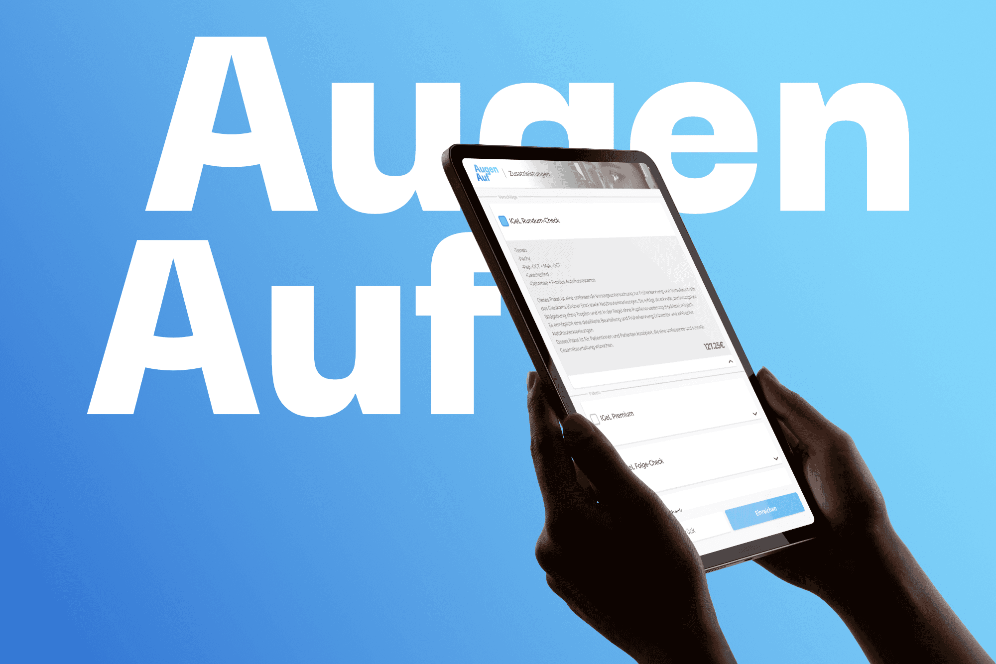
The Checkout screen is straightforward. Users select the tests they are interested in and see a summary of their choices. This way, staff receive a clear request rather than having to start the conversation from scratch.
Branding


Reflection
The core characteristic of this B2B project was designing for a client who would never directly use the product. There were three stakeholders: the clinic, the patients, and the medical assistants. They each brought their own requirements into the service.
That split created its own set of rules. To the patient, I was responsible for providing clear information without pressuring them into a decision about their own health. To the clinic owner, I owed a product that genuinely helps them to give better care for their patients, make more revenue, and decrease workload for their staff.
The user journey analysis was what gave me the leverage point. It let me define an interaction logic that focuses on informing patients rather than selling to them or collecting their data. Visually, I stayed deliberately plain. Given the target user group and where the product sits, the interface needed to feel simple, reliable and familiar.