Echoes
Awareness App to Mitigate Environmental Grief
Duration
3 months
source
Master's Project
Role
UX/UI desıgner
tools
Fıgma
team
svetlana chırkova
rıtu chowdhury
adrıta ghosh
elısa hıpolıto
keywords
Design Brief
The project started as a studio brief:
"Mitigating the impact of environmental grief on society. Design a concept for hope and mourning in the Anthropocene. Exercise it as a solution in the field of physical wellbeing and mental health."
It gave us an emotional territory and a field, but the task of defining a problem, a user, and a medium was ours. So the first half of the project went into discovering our direction before anything got designed.
Solution
We created a platform called Echoes for people who are anxious or suffering from environmental grief, but don't have the time or don't know where to start their eco-journey. Its main function is to integrate ecological habits into everyday life by encouraging individual eco-activism through gamification and storytelling.
product video
Process
Echoes was a team project. In the early stages, we worked all together on research, discovery, and synthesis to turn our brief into a defined problem and choose a direction.
When our direction was clear, I mainly took the responsibility of the product design, including the information architecture, the user flow, the wireframes, the component library, the high-fidelity screens, and the clickable prototype in Figma.
Research
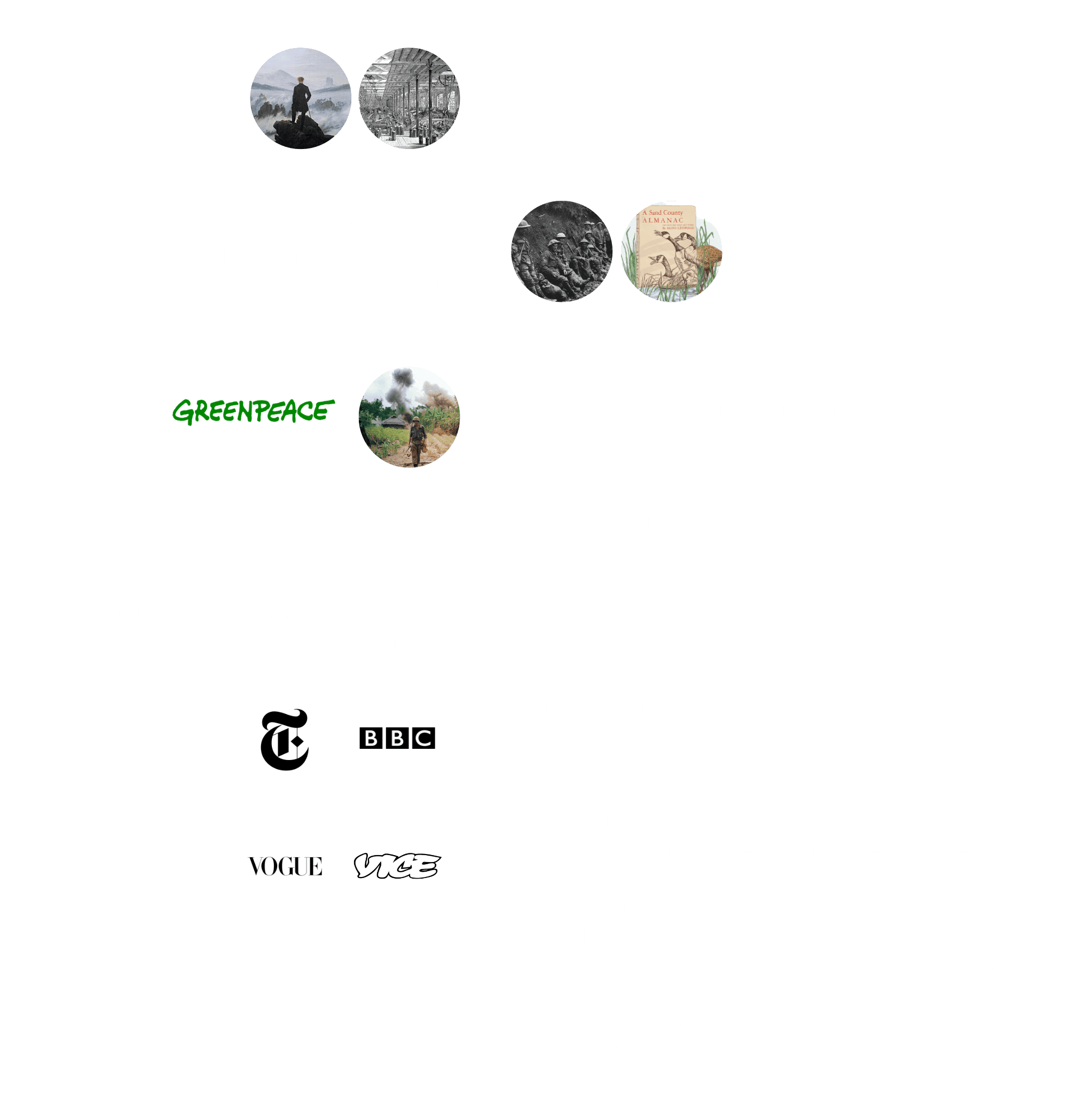
We started with a semantic analysis of the brief, investigating each keyword and defining it properly. Building on that, we examined the history of environmental grief, how different cultures approach it, and how artists and designers have responded to it throughout history. Alongside that we researched mental health and how it connects to climate change and environmental grief.
Semantic Analysis

History of Environmental Grief
Milestones in Art & Design


Relation of Mental Health & Climate Change
Based on our research, the main three mental illnesses caused by climate change are as follows:
Depression
Anxiety
Post-traumatic Stress Disorder
Children and residents of low and middle-income countries are especially vulnerable because of their reliance on agriculture and other industrial sectors that are susceptible to extreme weather changes, as well as limited access to infrastructure and resources critical for risk management. Therefore, as global warming progresses, the prevalence of mental illness is expected to increase.
At this point, we gathered ample amount of information to give project a clearer direction. Following a second semantic analysis session, the team decided to focus on the concept of coping strategies.
The rationale for our selection of the concept was twofold: inspiring people to take action with real impact, and helping them overcome the emotional turbulence they were going through on their own terms, encouraging resilience and sustainable habits.

Stakeholder Map

Interviews
To expand our knowledge about coping strategies, we set up a series of interviews with experts and with people directly affected by environmental change.
Psychiatrist & Psychologist
What are the differences between eco-anxiety and general anxiety or depression?
Common signs and symptoms
How is the brain affected after a traumatic experience?
What are the physiological stages?
How does media consumption affect it?
How can individuals stay informed without becoming overwhelmed or distressed?
Coping strategies for individuals experiencing (eco) anxiety
Specific therapeutic approaches or techniques that are particularly effective
Engaging in community or environmental activism as a coping mechanism
Personal experiences: how do you personally cope with these global challenges?

Food & Agribusiness Expert
What are the coping mechanisms in nature?
How are your personal practices and business (agriculture, beekeeping) affected by it?
How does it affect you emotionally?
What are your sources of information?
How do you find a balance between the scientific, personal and general approaches?
What are the recent environmental changes?
How do you see the future of your business? How do you think it is affected?

People Directly Affected
Have you noticed any changes in the weather or environment where you live?
What comes to mind when you think about climate change?
Awareness of climate change and its impact
How often do you think about this topic?
How do you get rid of those thoughts, or face them?

Personas
From the interviews, we built two personas. The first is the conventional one, a character assembled from the answers we heard most often. The second, which we called PersonAHA!, is an extreme case, someone whose interests conflict with the rest of the group.
Persona

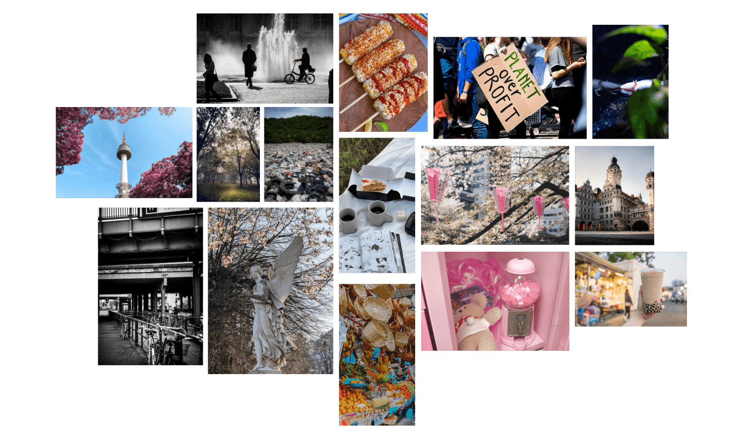
PersonAHA!


For the rest of the project, we carried the Persona forward, because she is the one directly and adversely affected by environmental change. But building the PersonAHA! was what made her legible. Defining the extreme case forced us to articulate what our actual user needs and struggles with, which is harder to see by looking only at the middle.
Synthesis
Bringing it all together, we came up with the idea of an app built around taking action as a coping strategy, using gamification to get people doing real eco-activities.
At the core of the product, we decided to have an ongoing, comic-style story that updates with news from around the world. At certain points, the story stops and assigns a mission to carry out in the real world. The user completes it, proves it, and earns Echoes (in-app points), which can be spent with partner local businesses, sustainable brands, or in our own merch store.
Via their actions, users move the story forward. As they complete missions, they adopt new habits, and as they pick up habits, they become the hero of the story.

Wireframes


Fınal product
Voices
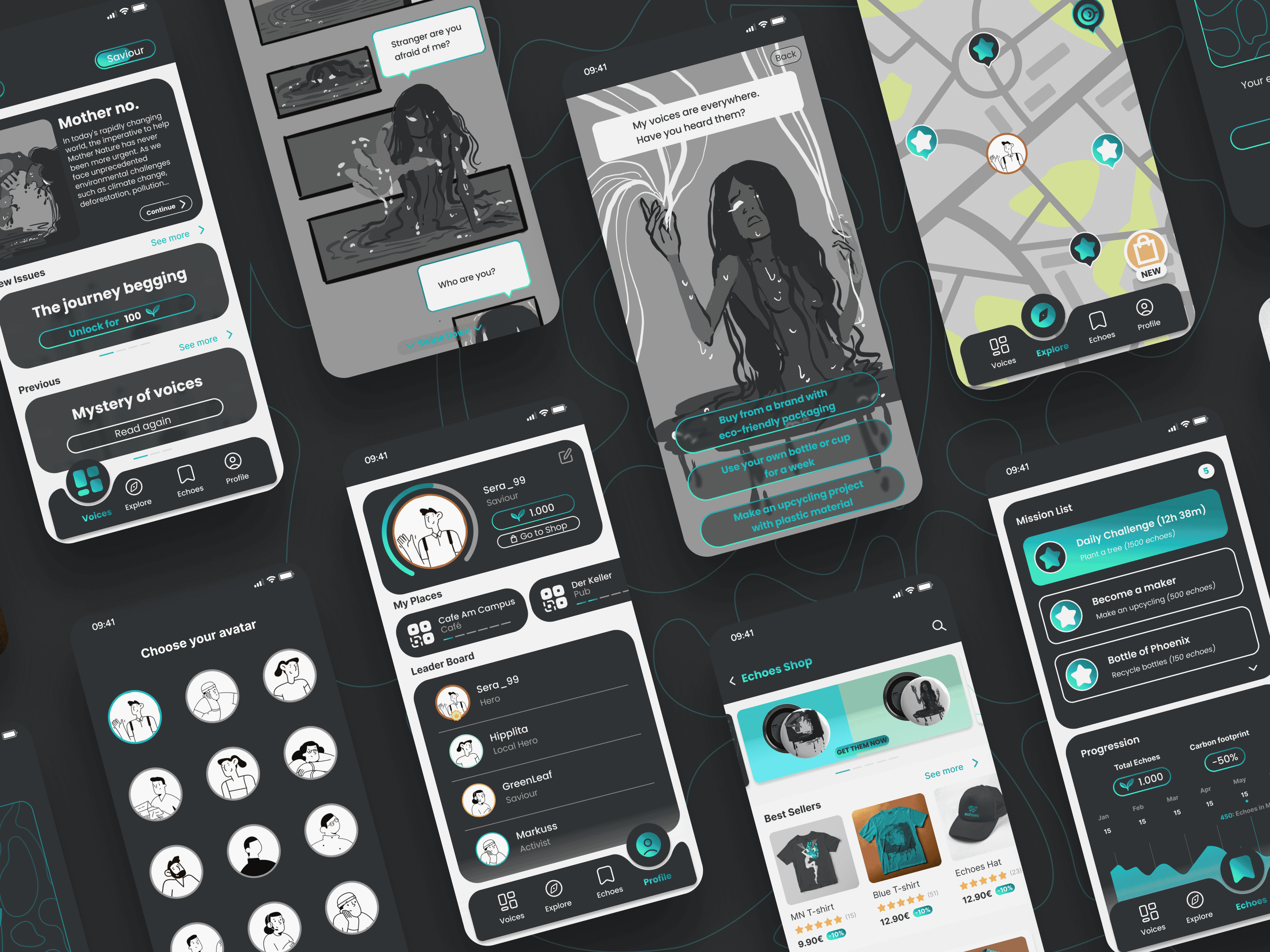
This tab is the core of the product, where storytelling and habit-building happen. Here, users experience the ongoing story. They read the current issue, pick up missions, and spend Echoes to unlock new chapters or revisit earlier ones.
Explore
In Explore tab, users find location-based missions and the local producers we partner with on the map.
They can also access our merchandise shop here. There, they can spend their Echoes to buy our merch or get discounts from our partner brands.
Echoes
On the Echoes tab, users find their missions and daily challenges. When they complete one, they can upload their proof and collect Echoes.
Here, they can also track their progress and how much they have reduced their carbon footprint through their own actions.
Profile
On the profile tab, users manage their account, check their Echoes balance, and access their loyalty cards. To support local partner businesses and increase their visibility, Echoes provides them with a digital loyalty system. The businesses reach more people who care about sustainable local producers, and users enjoy free drinks at their favourite places.
On the leaderboard, users track their friends' progress and compete with them by adopting a more sustainable lifestyle.
Visual Identity


Reflection
This was a research-heavy project, and the hardest part came at the beginning. Due to the broad brief, most of the early work was about deciding what we were actually trying to solve. Once we committed to coping strategies, the project started to take shape.
The highlight was building the persona. On a project about how people feel, creating a living, breathing persona matters even more than usual. This can only be done by distilling the smallest emotional signals from interviews with real people. Building an extreme character alongside the main persona forced us to articulate our users’ needs and the process they were going through.
The stakeholder map was another valuable tool. It helped us step back and view the wider system, which led us to a more holistic solution. As a result, the product evolved into a system that also supports local businesses and sustainable brands by increasing their visibility and encouraging them to adopt more sustainable business models.